Needless to say, 2D geographical plots constitute an essential part of the atmospheric and oceanographic researches. It’s crucial that one gets his plots correct and it would be of great help if he could make this process as easy and fluent as possible. In this post I’ll talk about some basic 2D geographical plotting workflows, using the matplotlib and basemap packages. Then we cover some common issues that are worth your attention when creating such plots.
Sample data
To facilitate illustration, we will be using some sample netcdf data, which can be downloaded from here. The data is a monthly average of the global Sea Surface Temperature (SST) obtained from the ERA-Interim reanalysis dataset. Some basic metadata of the SST sample:
- rank: 3
- shape: 1 (time) x 241 (latitude) x 480 (longitude)
- time: 1989-Jan average
- id: ‘sst’
- unit: ‘K’
To read in the netcdf file, we use the CDAT package. But you can use whatever you prefer, the main point is about the plotting of the data, not about the file IO. Just make sure that the data, and the latitude/longitude axes you read are of a numpy.ndarray compatible format.
Below is the code snippet for reading in the SST data and the latitude/longitude axes:
#-----------------Read sample data-----------------
import cdms2 as cdms
fin=cdms.open('sample.nc','r')
var=fin('sst')
fin.close()

var=var(squeeze=1) # make sure var is 2D

lat=var.getLatitude()[:]
lon=var.getLongitude()[:]
2D plotting function
Straight to the point, below is a function for handling 2D geographical plots, using either the imshow or contourf plotting method, two most commonly used plot types.
def plotGeoData(data, lon, lat, ax, method, levels, split=1, cmap=None):
    '''Plot 2D geo data using basemap

    Args:
        data (ndarray): 2d array data to plot.
        lon (ndarray): 1d array of longitude coordinates.
        lat (ndarray): 1d array of latitude coordinates.
        ax (plt axis): matplotlib axis object to plot on.
        method (str): type of plot, 'contourf': filled contour plot.
            'imshow': imshow plot.
        levels (list, tuple or 1darray): if method=='contourf', this is the
            contour levels to plot. If method=='imshow', the min value in
            <levels> is the lower bound, and max value in <levels> is the
            upper bound to plot the imshow.
    Keyword Args:
        split (int): control behavior of negative and positive values
            0: Do not split negatives and positives, map onto entire
               range of [0,1];
            1: split only when vmin<0 and vmax>0, otherwise
               map onto entire range of [0,1];
               If split is to be applied, negative values are mapped onto
               first half [0,0.5], and postives onto second half (0.5,1].
            2: force split, if vmin<0 and vmax>0, same as <split>==1;
                If vmin<0 and vmax<0, map onto 1st half [0,0.5];
                If vmin>0 and vmax>0, map onto 2nd half (0.5,1].
        cmap (colormap): if None, use a default one.
    Returns:
        cs (contour or imshow obj)
    '''
    from matplotlib.pyplot import MaxNLocator
    from mpl_toolkits.basemap import Basemap

    #------------------Create basemap------------------
    lat1=lat[0]
    lat2=lat[-1]
    lon1=lon[0]
    lon2=lon[-1]

    m = Basemap(projection='cyl', llcrnrlat=lat1, urcrnrlat=lat2,
                llcrnrlon=lon1, urcrnrlon=lon2, ax=ax)
    lon_m, lat_m = np.meshgrid(lon, lat)
    xi, yi = m(lon_m, lat_m)

    # set background color to a grey color. This is to distinguish areas with
    # valid white color (e.g. value==0) from areas with missing data (e.g.
    # land areas in SST data).
    ax.patch.set_color('0.5')

    #-------------------Get overflow-------------------
    vmin=np.nanmin(data)
    vmax=np.nanmax(data)
    if vmin < np.min(levels) and vmax > np.max(levels):
        extend='both'
    elif vmin >= np.min(levels) and vmax > np.max(levels):
        extend='max'
    elif vmin < np.min(levels) and vmax <= np.max(levels):
        extend='min'
    else:
        extend='neither'

    #---------------------Colormap---------------------
    if cmap is None:
        cmap=plt.cm.RdBu_r

    # split positive/negative values for divergent colormap
    if split==1 or split==2:
        cmap=remappedColorMap(cmap, levels[0], levels[-1], split)

    #-------------Plot according to method-------------
    if method=='contour':

        cs = m.contourf(xi, yi, data, levels=levels, cmap=cmap, extend=extend)

    elif method=='imshow':
        cs=m.imshow(data, cmap=cmap, origin='lower',
                vmin=levels[0], vmax=levels[-1],
                interpolation='nearest',
                extent=[lon1, lon2, lat1, lat2],
                aspect='auto')
    # you can add other plot types, but these 2 are most commonly used.

    #----------------Draw other things----------------
    m.drawcoastlines()

    # draw lat lon labels. I found this more care-free, you don't have to
    # specify the locations manually.
    loclatlon=MaxNLocator(nbins='auto', steps=[1,2,2.5,3,4,5,6,7,8,8.5,9,10])
    lat_labels=loclatlon.tick_values(lat1, lat2)
    lon_labels=loclatlon.tick_values(lon1, lon2)

    m.drawparallels(lat_labels, linewidth=0,labels=[1,1,0,0], fontsize=10)
    m.drawmeridians(lon_labels, linewidth=0,labels=[0,1,0,1], fontsize=10)

    cbar = m.colorbar(cs, pad="10%", location='bottom', extend=extend)
    cbar.set_ticks(levels)

    return cs
break down the plotGeoData() function
We first, in Line 39-40, create a basemap object using the cyl (cylindrical) map projection, and the latitude/longitude coordinates of the 4 corners of the map domain.
Then some preparation work is done in Line 47-67, including:
- set the background color to grey (for reason explained further later).
- get the overflow option, and
- get a default colormap, if None is provided. Also perform a color remapping. I’ll explain this later.
In Line 70-79, the plotting is done, using either contourf or imshow plotting method, depending on the input argument method. Other than these two, there is also a pcolormesh plotting method, which works very similar as imshow, and a contour method which is similar to contourf. I’m not adding these here. You can experiment with them yourself. Topics of vector plots (quivers) and hatching (to indicate, e.g. statistical significance) will be covered in separate posts.
Lastly, we add some map information to the plot:
- draw the continents using
m.drawcoastlines()(Line 83). - add latitude/longitude labels (Line 87-92), and
- add a colorbar (Line 94-95).
Here is the definition of the remappedColorMap() function called at Line 67:
def remappedColorMap(cmap,vmin,vmax,split=2,name='shiftedcmap'):
    '''Re-map the colormap to split positives and negatives.

    Args:
        cmap (matplotlib colormap): colormap to be altered.
        vmin (float): minimal level in data.
        vmax (float): maximal level in data.
    Keyword Args:
        split (int): control behavior of negative and positive values
            0: Do not split negatives and positives, map onto entire
               range of [0,1];
            1: split only when vmin<0 and vmax>0, otherwise
               map onto entire range of [0,1];
               If split is to be applied, negative values are mapped onto
               first half [0,0.5], and postives onto second half (0.5,1].
            2: force split, if vmin<0 and vmax>0, same as <split>==1;
                If vmin<0 and vmax<0, map onto 1st half [0,0.5];
                If vmin>0 and vmax>0, map onto 2nd half (0.5,1].
        name (str): name of remapped colormap.
    Returns:
        newcmap (matplotlib colormap): remapped colormap.
    '''
    import numpy
    import matplotlib
    import matplotlib.pyplot as plt

    #-----------Return cmap if not splitting-----------
    if split==0:
        return cmap
    if split==1 and vmin*vmax>=0:
        return cmap

    #------------Resample cmap if splitting------------
    cdict = {\
    'red': [],\
    'green': [],\
    'blue': [],\
    'alpha': []\
    }

    vmin,vmax=numpy.sort([vmin,vmax]).astype('float')
    shift_index=numpy.linspace(0,1,256)

    #-------------------Force split-------------------
    if vmin<0 and vmax<=0 and split==2:
        if vmax<0:
            idx=numpy.linspace(0,0.5,256,endpoint=False)
        else:
            idx=numpy.linspace(0,0.5,256,endpoint=True)

    elif vmin>=0 and vmax>0 and split==2:
        idx=numpy.linspace(0.5,1,256,endpoint=True)

    #--------------------Split -/+--------------------
    if vmin*vmax<0:
        mididx=int(abs(vmin)/(vmax+abs(vmin))*256)
        idx=numpy.hstack([numpy.linspace(0,0.5,mididx),\
                numpy.linspace(0.5,1,256-mididx)])

    #-------------------Map indices-------------------
    for ri,si in zip(idx,shift_index):
        r, g, b, a = cmap(ri)
        cdict['red'].append((si, r, r))
        cdict['green'].append((si, g, g))
        cdict['blue'].append((si, b, b))
        cdict['alpha'].append((si, a, a))
    newcmap = matplotlib.colors.LinearSegmentedColormap(name, cdict)
    plt.register_cmap(cmap=newcmap)

    return newcmap
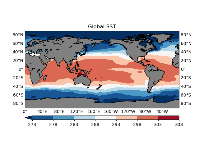
Now do a test drive:
fig,ax=plt.subplots()
levels=np.arange(273, 310, 5)
plotGeoData(var, lon, lat, ax, 'contour', levels)
ax.set_title('Global SST')
fig.show()
Some common plot issues
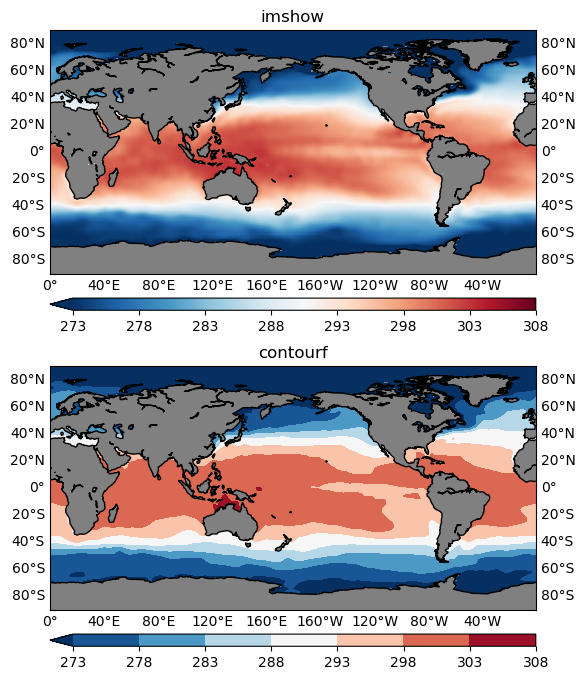
contourf or imshow
Both can be used to visualize your 2D data, however, in most cases, contourf is more preferable. Because it is easier to read the values with the help of a colorbar (Figure 2), and identify some critical boundaries, such as the 0-anomaly contour line, in a contour plot.
However, in some cases imshow is more appropriate. One such example is that when your data is categorical rather than continuous. For instance, the geographical data is showing some region classifications represented by a sequence of integer labels: 1 for the 1st class type, 2 for the 2nd class type and so on. Then you should not use the contouring functions which would interpolate the categorical labels, giving some floating point values like 1.2, 1.983 that don’t make sense for categorical data. For the same reason, when plotting using the imshow() function, you will need to pass in the interpolation='nearest' argument, to make sure no interpolation is happening.
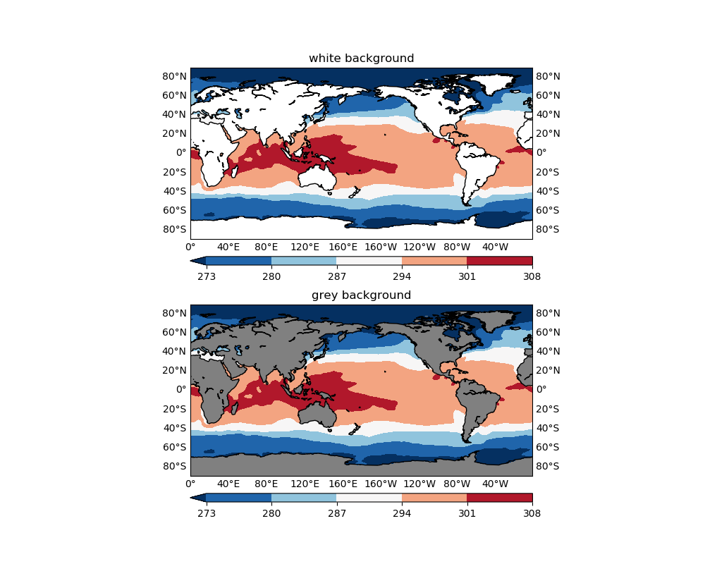
Missing values
Recall that in our plotGeoData() function, we set the background color of the plot to grey (which just happens to be 50 shades):
ax.patch.set_color('0.5')
The background color will be shown where data are missing, in this case, over land areas where SST has no definition. If not set, matplotlib sets the default background color to white, which also appears in many colormaps (e.g. the plt.cm.RdBu_r used in Figure 1). Therefore it is easy to confuse your audience with the missing values and valid data values that happen to be represented with white color (or something very close to white). See the comparison below:
figure=plt.figure(figsize=(10, 8), dpi=100)
levels=np.arange(273, 310, 7)

#------------------Use white------------------
ax1=figure.add_subplot(2,1,1)
cs1=plotGeoData(var, lon, lat, ax1, 'contour', levels)
ax1.patch.set_color('w')
ax1.set_title('white background')

#------------------Use grey------------------
ax2=figure.add_subplot(2,1,2)
cs2=plotGeoData(var, lon, lat, ax2, 'contour', levels)
ax2.set_title('grey background')

figure.show()
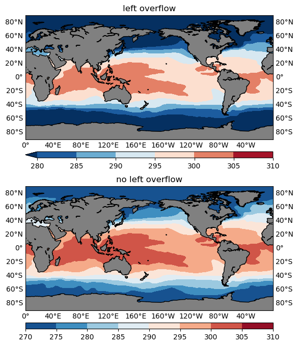
Overflow
Overflow is represented by the triangle(s) in the colorbar of a plot (e.g. all figures shown so far), it signals that all values below the minimum overflow level are represented by the color of the left triangle, and all values above the maximum overflow level by the right triangle. Namely, you choose to selectively plot only a subset range of the data values.
Usually you use overflow to hide some individual outliers that inflate your colorbar, or to achieve a better representation of the key information the plot is intended to deliver.
Overflow should ONLY be used if the range of data exceeds the range you
would like to plot, and you have to check the minimum and maximum separately.
Choose the range (by setting a suitable levels argument to the plotGeoData() function) that best describe the
data of interest, e.g. for extreme precipitation, maybe only plot the range >= 10 mm/day. Then there will be an overflow on the minimum side of the colorbar, and anything below 10 mm/day will be plotted using the leftmost color. It doesn’t make
sense to set the range to start from 0 and add a left overflow, because
precipitation can’t be negative.
The following snippet compares one plot with a left overflow with one without:
figure=plt.figure(figsize=(10, 8), dpi=100)
levels=np.arange(280, 315, 5)

#------------------make left overflow------------------
ax1=figure.add_subplot(2,1,1)
cs1=plotGeoData(var, lon, lat, ax1, 'contour', levels)
ax1.set_title('left overflow')

#------------------no left overflow------------------
ax2=figure.add_subplot(2,1,2)
cs2=plotGeoData(var, lon, lat, ax2, 'contour', levels)
ax2.set_title('no left overflow')

figure.show()
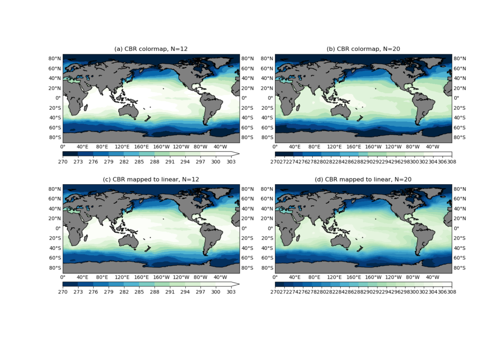
Custom colormap
matplotlib comes with a collection of colormaps that you can access with the expression plt.cm.<colormap_name>. But sometimes you may want to use a colormap designed by a third party, for instance some color tables offered by NCAR. Some care needs to be taken when using such custom colormaps.
Taking the CBR_wet color table linked above as an example, it is an 11-color table, which means that it works out of the box for a 12-level contour plot. Other than that, you will have to interpolate the colors.
Below is the content of the CBR_wet.txt color table, and the code snippet to read it into a numpy array:
255  255  255
247  252  240
224  243  219
204  235  197
168  221  181
123  204  196
 78  179  211
 43  140  190
  8  104  172
  8   64  129
  0   32   62
from matplotlib.colors import ListedColormap
cmapdata = np.loadtxt('CBR_wet.txt')/255.
cmapdata = cmapdata[::-1] # revert order
cmap = ListedColormap(cmapdata)
We created a ListedColormap from the color table using cmap = ListedColormap(cmapdata).
Note that in this documentation page, it is stated that for ListedColormap:
The colormap is a lookup table, so "oversampling" the colormap returns nearest-neighbor interpolation
What does it mean? Let’s see an example:
figure=plt.figure(figsize=(14, 12), dpi=100)

from matplotlib.colors import ListedColormap, LinearSegmentedColormap
cmapdata = np.loadtxt('CBR_wet.txt')/255.
cmapdata = cmapdata[::-1] # revert order
cmap = ListedColormap(cmapdata)
cmap2=LinearSegmentedColormap.from_list('new_cmp', cmapdata)

levels_small=np.arange(270, 270+3*12, 3)
levels_large=np.arange(270, 310, 2)

#------------------Your colormap, smaller level number------------------
ax1=figure.add_subplot(2,2,1)
cs1=plotGeoData(var, lon, lat, ax1, 'contour', levels_small, cmap=cmap)
ax1.set_title('(a) CBR colormap, N=12')

#------------------Your colormap, larger level number------------------
ax2=figure.add_subplot(2,2,2)
cs2=plotGeoData(var, lon, lat, ax2, 'contour', levels_large, cmap=cmap)
ax2.set_title('(b) CBR colormap, N=20')

#---your colormap change to a linear one, small level number ---
ax3=figure.add_subplot(2,2,3)
cs3=plotGeoData(var, lon, lat, ax3, 'contour', levels_small, cmap=cmap2)
ax3.set_title('(c) CBR mapped to linear, N=12')

#---your colormap change to a linear one, large level number ---
ax4=figure.add_subplot(2,2,4)
cs4=plotGeoData(var, lon, lat, ax4, 'contour', levels_large, cmap=cmap2)
ax4.set_title('(d) CBR mapped to linear, N=20')

figure.show()
We created 4 subplots:
- (a): The number contour levels is
N=12, and it is using the colormapcmapcreated as aListSegmentedColormapusing theCBR_wetcolor table. - (b): The same
cmapis used, but with a 20-level contour. - (c): The number of contour levels is
N=12, same as in (a). But the colormap is aLinearSegmentedColormapcreated using
cmap2=LinearSegmentedColormap.from_list('new_cmp', cmapdata)
- (d):
N=20, same as in (b); Colormap used iscmap2, same as in (c).
It can be seen that (a) and (c) are identical (see Figure 4 below), because the CBR_wet is an 11-color table, and N=12, so everything works as expected. But when N=20, the ListSegmentedColormap will use "nearest-neighbor interpolation" to get all the color values. That’s why you see some contour levels share the same color in the colorbar (Figure 4b).
The bottom row is created using a LinearSegmentedColormap colormap created from the CBR_wet color values, and everything looks correct in both N=12 and N=20 cases.
In conclusion, if you would like to import some third party designed colormap, make sure to create a LinearSegmentedColormap to prevent artifacts in the colorbar.
Choose the contour levels
The levels argument is used to specify the contourf contour levels. Your data may come with various orders of magnitudes, and sometimes it can be a bit tricky (and annoying) to manually craft a contour level for each and every plot you create, particularly when you just want to have a quick read of the data. It would be nice to have some helper function that you only need to throw at it whatever data you want to plot, and it will generate a nicely spaced contour level for you. We will be looking at such a function in this section.
Below is a mkscale() function obtained and modified from the vcs/util.py code, which is part of the CDAT Python package:
def mkscale(n1,n2,nc=12,zero=1):
    '''Copied from vcs/util.py

    Function: mkscale

    Description of function:
    This function return a nice scale given a min and a max

    option:
    nc # Maximum number of intervals (default=12)
    zero # Not all implemented yet so set to 1 but values will be:
           -1: zero MUST NOT be a contour
            0: let the function decide # NOT IMPLEMENTED
            1: zero CAN be a contour  (default)
            2: zero MUST be a contour
    Examples of Use:
    >>> vcs.mkscale(0,100)
    [0.0, 10.0, 20.0, 30.0, 40.0, 50.0, 60.0, 70.0, 80.0, 90.0, 100.0]
    >>> vcs.mkscale(0,100,nc=5)
    [0.0, 20.0, 40.0, 60.0, 80.0, 100.0]
    >>> vcs.mkscale(-10,100,nc=5)
    [-25.0, 0.0, 25.0, 50.0, 75.0, 100.0]
    >>> vcs.mkscale(-10,100,nc=5,zero=-1)
    [-20.0, 20.0, 60.0, 100.0]
    >>> vcs.mkscale(2,20)
    [2.0, 4.0, 6.0, 8.0, 10.0, 12.0, 14.0, 16.0, 18.0, 20.0]
    >>> vcs.mkscale(2,20,zero=2)
    [0.0, 2.0, 4.0, 6.0, 8.0, 10.0, 12.0, 14.0, 16.0, 18.0, 20.0]

    '''
    if n1==n2: return [n1]
    import numpy
    nc=int(nc)
    cscale=0  # ???? May be later
    min=numpy.min([n1,n2])
    max=numpy.max([n1,n2])
    if zero>1.:
        if min>0. : min=0.
        if max<0. : max=0.
    rg=float(max-min)  # range
    delta=rg/nc # basic delta
    # scale delta to be >10 and <= 100
    lg=-numpy.log10(delta)+2.
    il=numpy.floor(lg)
    delta=delta*(10.**il)
    max=max*(10.**il)
    min=min*(10.**il)
    if zero>-0.5:
        if delta<=20.:
            delta=20
        elif delta<=25. :
            delta=25
        elif delta<=40. :
            delta=40
        elif delta<=50. :
            delta=50
        elif delta<=60.:
            delta=60
        elif delta<=70.:
            delta=70
        elif delta<=80.:
            delta=80
        elif delta<=90.:
            delta=90
        elif delta<=101. :
            delta=100
        first = numpy.floor(min/delta)-1.
    else:
        if delta<=20.:
            delta=20
        elif delta<=25. :
            delta=25
        elif delta<=40. :
            delta=40
        elif delta<=50. :
            delta=50
        elif delta<=60.:
            delta=60
        elif delta<=70.:
            delta=70
        elif delta<=80.:
            delta=80
        elif delta<=90.:
            delta=90
        elif delta<=101. :
            delta=100
        first=numpy.floor(min/delta)-1.5

    scvals=delta*(numpy.arange(2*nc)+first)
    a=0
    for j in range(len(scvals)):
        if scvals[j]>min :
            a=j-1
            break
    b=0
    for j in range(len(scvals)):
        if scvals[j]>=max :
            b=j+1
            break
    if cscale==0:
        cnt=scvals[a:b]/10.**il
    else:
        #not done yet...
        raise Exception('ERROR scale not implemented in this function')
    return list(cnt)
What mkscale() does is accepting a minimum and a maximum value (n1 and n2 respectively), and a proposed number of contours (nc), and it will output a nicely spaced contour level covering the the given data range, with a number of contour levels close to the proposed nc.
What I meant by "nicely spaced" contour level is that the contour level values won’t be some floating point numbers with 5+ decimal places, like what you would get using
>>> np.linspace(0, 30, 12)
array([ 0.        ,  2.72727273,  5.45454545,  8.18181818, 10.90909091,
       13.63636364, 16.36363636, 19.09090909, 21.81818182, 24.54545455,
       27.27272727, 30.        ])
Compare that with the mkscale()‘s answer:
>>> mkscale(0, 30, 12)
[0.0, 2.5, 5.0, 7.5, 10.0, 12.5, 15.0, 17.5, 20.0, 22.5, 25.0, 27.5, 30.0]
This is certainly more desirable for a publishable work.
But note that in order to achieve these nice looking numbers, the resultant level number is not always the same as the proposed one (in this case, 13 instead of 12). However, this is surely a worthy trade, and I found no problem accepting the mkscale() levels over about 98 percent of the time.
Now make a comparison with a manual contour level v.s. an auto contour level using the SST sample data. The results are given in Figure 5 below.
figure=plt.figure(figsize=(10, 8), dpi=100)

#------------------manual levels------------------
ax1=figure.add_subplot(2,1,1)
levels=np.arange(280, 315, 5)
cs1=plotGeoData(var, lon, lat, ax1, 'contour', levels)
ax1.set_title('manual levels')

#------------------auto levels------------------
ax2=figure.add_subplot(2,1,2)
levels=mkscale(np.nanmin(var), np.nanmax(var), 10)
cs2=plotGeoData(var, lon, lat, ax2, 'contour', levels)
ax2.set_title('auto level')

figure.show()
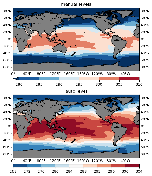
Note that the min and max values (n1, n2) don’t have to be the actual minimum and maximum values of the data, you can, and would more often than not like to use a smaller range, for instance, the 5th percentile for n1, and the 95th percentile for n2. Combined with the overflow technique discussed above, this would help hide some extreme values (outside of the 5-95th percentile range) and make full use of the entire color range to represent the majority (the inner 90% of the data range) of the variability.
Align the center value in a divergent colormap
Divergent colormaps are those that have a central color value in the middle, a left wing (don’t go political) for representations of the lower values, and a right wing for the higher values. The RdBu_r colormap used in previous plots is one divergent colormap, with a transition from dark blue (the minimum) to white in the middle, and finally to dark red (the maximum) on the right.
The middle color (white in this case) usually corresponds to critical transition in the data (e.g. going from negative to positive), therefore it is crucial to make sure they are aligned up. Otherwise it will be very difficult to read the plot correctly — it’s just too intuitive for the human eyes to make the association which would be misleading if the central color and central value are not aligned. Let’s see an example:
ano=var-277  # 277 is NOT the mean, so asymmetrical
ano2=var-var.mean()  # symmetrical

figure=plt.figure(figsize=(14, 12), dpi=100)
# NOTE set zero=-1 so 0 won't appear as a level
levels=mkscale(np.nanmin(ano), np.nanmax(ano), 10, zero=-1)
levels2=mkscale(np.nanmin(ano2), np.nanmax(ano2), 10, zero=-1)

#------------------Asymmetrical not aligned------------------
ax1=figure.add_subplot(2,2,1)
cmap=plt.cm.RdBu_r
cs1=plotGeoData(ano, lon, lat, ax1, 'contour', levels, cmap=cmap, split=0)
ax1.set_title('asymmetrical, not aligned')

#------------------symmetrical, not aligned------------------
ax2=figure.add_subplot(2,2,2)
cmap=plt.cm.RdBu_r
cs2=plotGeoData(ano2, lon, lat, ax2, 'contour', levels2, cmap=cmap, split=0)
ax2.set_title('symmetrical, not aligned')

#------------------Asymmetrical aligned------------------
ax3=figure.add_subplot(2,2,3)
cmap=plt.cm.RdBu_r
cs3=plotGeoData(ano, lon, lat, ax3, 'contour', levels, cmap=cmap, split=1)
ax3.set_title('asymmetrical, aligned')

#------------------symmetrical, aligned------------------
ax4=figure.add_subplot(2,2,4)
cmap=plt.cm.RdBu_r
cs4=plotGeoData(ano2, lon, lat, ax4, 'contour', levels2, cmap=cmap, split=1)
ax4.set_title('symmetrical, aligned')

figure.show()
In the code snippet above, we created 2 new data variables:
ano = var - 277: deviations from the constant level277, which is not the mean ofvar, so it is an asymmetrical anomaly, i.e. the greatest (absolute) negative anomaly does not equal the greatest positive anomaly.ano2 = var - var.mean(): deviations from the mean level ofvar, so it is a symmetrical anomaly.
4 subplots are then created:
- (a): plot the asymmetrical anomaly (
ano) with a defaultRdBu_rdivergent colormap. - (b): plot the symmetrical anomaly (
ano2) with a defaultRdBu_rdivergent colormap. - (c): plot the asymmetrical anomaly (
ano) with a remapped divergent colormap. - (d): plot the symmetrical anomaly (
ano2) with a remapped divergent colormap.
The remapped colormap is created using
cmap=remappedColorMap(cmap, levels[0], levels[-1], split)
inside the plotGeoData() function. And the definition of remappedColorMap() is given above.
Here is the resultant plot:
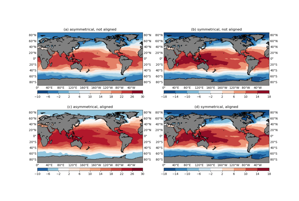
ano) with a default RdBu_r divergent colormap.(b): plot the symmetrical anomaly (
ano2) with a default RdBu_r divergent colormap.(c): plot the asymmetrical anomaly (
ano) with a remapped divergent colormap.(d): plot the symmetrical anomaly (
ano2) with a remapped divergent colormap.It can be seen that for symmetrical anomalies ((b) and (c)), it makes no difference whether you explicitly align the colormap or not. However, for an asymmetrical anomaly, the default RdBu_r colormap puts the 0-crossing contour interval (-2 to 2) to a blue color, and the most neutral color is assigned to the contour level 10 (Figure 6a). Just by looking at the plot, do you feel the struggle of the rational reading of the colorbar fighting against the natural response that associates the 0 value to a white color?
In Figure 6c, the colormap is remapped using the remappedColorMap() function, so that the central value (in this case 0) is aligned with the central color (white), and the left/right branches are linearly interpolated separately. The effect is that it is not only more aligned with our visual impression of the figure, the greater-ranged positive branch also gets a greater-ranged red color variation, allowing more detailed depiction of the positive values.
Also note that when creating the contour levels, we are giving a zero=-1 argument to the mkscale() function:
levels=mkscale(np.nanmin(ano), np.nanmax(ano), 10, zero=-1)
zero=-1 prevents the number 0 from being included in the contour levels, instead, there would be a 0-crossing contour interval, e.g. -2, 2 in this case, that represent the 0-level with a range. This is very helpful in plots with a divergent colormap. Your plot will have a white contour interval, rather than just various shades of blues and reds. The white area represents a kind of buffer zone in which the difference is not far from 0, and the plot will almost always end up being cleaner and more informative. You can try using zero=1 instead and compare the difference.
Concluding remarks
In this post I introduced a function to handle 2D geographical plots using matplotlib and basemap. The 2 most commonly used plot types, imshow and contourf are supported by the plot function, but contourf is the generally more preferable choice. We then talked about some common issues in 2D geographical plots, including the appropriate choice of missing value color, the correct usage of overflows, custom colormaps, and a method to automatically generate good looking contour levels.
There are a few other remarks worth pointing out:
basemap is being deprecated.
The basemap project is being deprecated, and the go-to replacement is Cartopy. (basemap is no longer installable via pip, but can still be done in conda.) Unfortunately, not all the functionalities of basemap have direct replacement in Cartopy, yet. So if you need to create some real complicated geographical plots, there might be some niche usage cases that Cartopy can’t support out-of-the-box. However, for simple plots like the ones in this post, Cartopy can handle just as well. If you are writing some code for the community, it will be more future-proofing, if not mandatory, to use Cartopy instead.
Vector/quiver plots
With the current plotGeoData() function, it is relatively easy to write a new one to create vector/quiver plots. The new function will accept 2, instead of 1 input data variables, and the rest are more or less the same. The extra bits to consider in vector plots are the choice of scale to the quiver() function, and the reference key length created using quiverkey() function. These two need to work together to create good looking quiver plots. I might devote another post talking about this in the future.
Extend the plotGeoData() function
The current plotGeoData() has a fair amount of functionalities and can automate some aspect of your plotting routine, such as the automatic setup of the basemap domain, automatic detection of overflows, a default colormap to plot with if None is provided, and the automatic labeling the longitude/latitude axes. However, there are still some aspects not covered, and you can use the current version as a start to extend its functionality. Here are some things to consider:
- Map projection has been hard-coded to
cyl, you may want to make it into a keyword input argument so that the user can specify a different one. - Support other plot types such as pcolormesh.
- Allow finer control of the colorbar, for instance, make it possible to draw vertical colorbars, or put alternating colorbar ticks on both sides of the colorbar.
- If your input data variable has the units metadata, plot out the unit text alongside the colorbar.
- Make it possible for multiple subplots to share the same colorbar.
- Longitude/latitude labels are currently plotted out on the left, right and bottom edges of the map. In some subplot configurations, such as the 2×2 layout in Figure 4, you may want to omit the labels in the inner gaps between subplots, to save some space. A tip to help achieve this: the
ax.get_geometry()method can give some hints on where the current axisaxis in the subplot layout. - What if the input data variable is 3D or 4D, can you write a helper function to automatically slice out the 1st time slice of the data and plot it out?
- How to make overlay plots, for instance,
contourfas a colored contour, and a blackcontouron top of that. - Combined the alias tip talked about in Debugging Python using
pdbandpdbrc, create apdbrcalias command so that when you are debugging the code, a simplepl datawill create a good quality geographical plot and pop up the figure window.
Save figure format
My personal preference is to save 2 copies of the same plot, one in png format, and another in pdf, using the following codes:
plot_save_name='plot_file_name'
print('\n# <basemap_plot>: Save figure to', plot_save_name)
figure.savefig(plot_save_name+'.png',dpi=100,bbox_inches='tight')
figure.savefig(plot_save_name+'.pdf',dpi=100,bbox_inches='tight')
bbox_inches='tight' helps trim down the outer margins. The png version is easier to view in an image viewer or as thumbnails in the file manager, and the pdf version will be one of choice if I decide to insert the image into a manuscript, to be compiled with LaTeX. Because it is a vector graph (in contrary to the png format which is raster), the pdf image allows infinite scaling without loss of quality, therefore more suitable, in general, for publication purposes. There is also an eps format that you can save using the matplotlib savefig() function, however, to compile the LaTeX document using the pdflatex software, you will have to convert these eps images to pdf first, so it would be easier to use pdf directly.
Close the figure to save RAM
This might have been fixed in newer versions of matplotlib. Just to be extra safe, if you find yourself creating some figures in a big loop, you may want to make sure the figure is saved to disk, and the figure object closed. Otherwise, the figures may not be destroyed properly, and eventually eat up your RAM. To close a figure:
plt.close(figure)